A major new version of the app is here
Today, we’re excited to show you the major new version of the SpreadCharts app that’s been in the works for a long time. In short: we kept the iconic design and simplicity you all love, but unleashed its maximum potential. Before we get into all the new features, here are a few important points:
- The new version will run in parallel with the old app for many months at testing.spreadcharts.com
- This new app is a beta version – it contains bugs, and its final form will also be influenced by a survey we’ll send to premium users.
- The desktop version is supported for now, as we haven’t really focused on the mobile version yet (it works, but isn’t optimized at all).
- Use the same login credentials in the new app (FYI: don’t forget to reset your password if you haven’t done so already since that bug in December).
- The testing version has up-to-date market data, signals, and will load your user data (watchlist, charts).
- Charts in your watchlist from the old app should work in the new app (and vice versa), only drawings and highlights won’t be transferred.
And now, the exciting new features.
Speed
This was our number one focus. A new charting engine, together with countless optimizations on our side, makes the app much faster. Previously, there was a hardcoded limit of 30 years on the maximum length of data displayed in a single chart. Not anymore. For example, take a look at this continuous contract for wheat since 1959! It’s the entire history for this commodity.
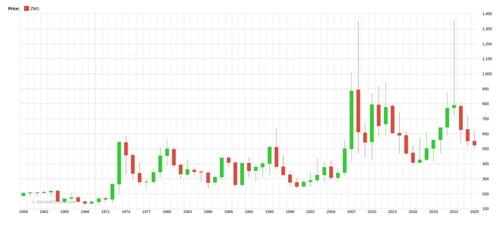
The speedup will be most apparent when working with multiple charts at once. That said, keep in mind your own PC or device remains the limiting factor in performance. Our software is unique in that it gives you the freedom to open many charts at once, some of them composed of multiple subcharts of continuous contracts spanning decades. That could be tens of thousands of data points. No other platform allows this! Beyond a certain point, you just need hardware powerful enough to make it work.
New way to manipulate charts
This is actually the most significant change to the way you’re used to working with charts. We’ll be especially interested in your feedback on this change in the survey we’ll send later this year.
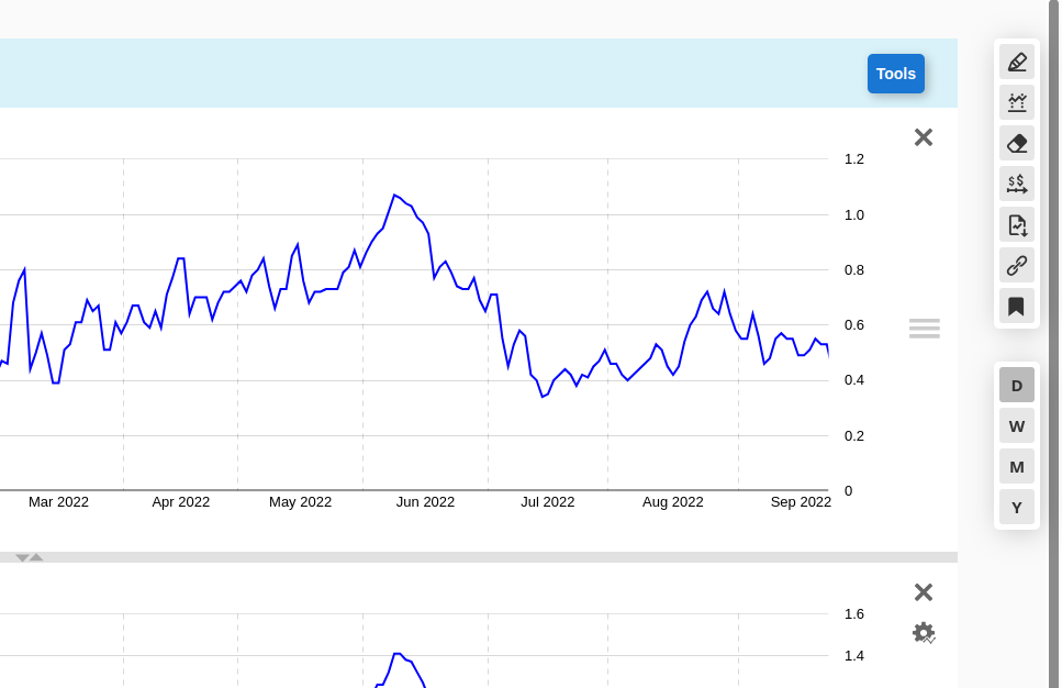
We unified the way you control the charts on PC with mobile devices. This is also the norm on other charting platforms. Instead of selecting a period with buttons, you now select the candle aggregation – daily (D), weekly (W), or yearly (Y) – and use your mouse wheel (or pinch to zoom on mobile) to zoom in/out on the chart, or drag the chart left or right to move the displayed period.
We’d like to ask you to give it some time and try it out. We’ll be very interested in your feedback about this change once we send out the survey later this year.
Everything moves!
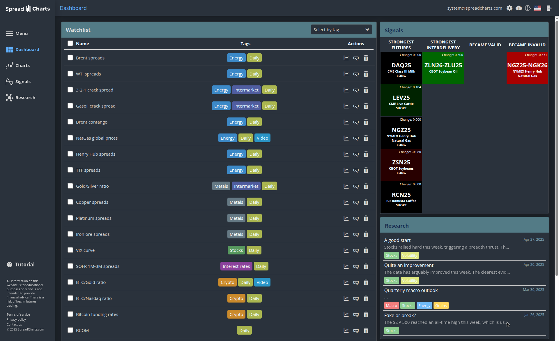
Our users love how easy it is to move the records in their watchlist around by just dragging and dropping them where they wish.
And now, everything can be moved around. Not just tags in the tag selector, but also tabs with charts, and even the subcharts themselves within a tab!
Plus, a neat little feature to close all chart tabs at once.
Dark mode
If you’re used to working at night, this will be a very pleasant improvement. Just switch between the light and dark themes in the top right corner of the app.
We still have to adjust the colors in some chart types here and there, but I’d say this will greatly reduce your eyestrain even in the beta version.
Multilingual support
Yes, America First. That’s also true for country ranking by number of SpreadCharts app users. However, despite being number one, users from other countries together outnumber Americans. And not all of them speak English. So, the entire app’s interface can now be switched to a different language using the toggle in the top right corner.
Supported languages currently are:
- English
- German
- Italian
- Spanish
- Czech
We used machine translation for DE, IT and ES, so if you encounter any nonsense, we’d be grateful if you let us know on X or by email.
New Research
Last year, we began sending short research notes by email as a bonus to our regular video analyses. And you love it. The feedback has been overwhelmingly positive. Therefore, I decided to switch the research format entirely to text from now on (articles with charts).
My motivation:
- I hate making those videos.
- …and therefore, the quality of these videos is underwhelming. Not the content, but the form. I shoot these videos without any preparation, so there are frequent umms and ahhs. Sometimes I even forget to mention something during the recording, or waste time on unimportant details. Written articles solve this, as they allow me to add/remove anything during proofreading once I finish the text.
- Articles are more concise and you can easily skip the parts that you’re not interested in (for example, about markets you don’t trade). This saves your time.
- We can translate the texts into different languages, opening our Research to more people who don’t speak English. Every research article will be immediately available upon release in DE, IT, ES and CZ, in addition to EN. We use machine translation (OpenAI API), and the GPT models will keep improving over time, but I still recommend you read the English original if you can.
What’s next?
In the coming months, we’ll continue to squash bugs and implement improvements based on feedback from premium users. Moreover, we’ll start working on mobile optimizations, as this is another major goal for this new release.
So, stay tuned!
Check out these great articles as well
New data: Sector indices
Our software is already established well beyond commodity market analysis. Stock indices, currencies, and even...
Read moreWhat’s new in the SpreadCharts app?
It’s been a few months since we launched the new version of the SpreadCharts app....
Read moreLiberation Day!
Tariffs are arguably the dumbest part of Trump’s agenda. Yes, the goal makes perfect sense,...
Read moreWhy is the Dollar falling when stocks are cratering?
We have received the same question from several of our subscribers over the past week....
Read more