Introducing historical ratio charts
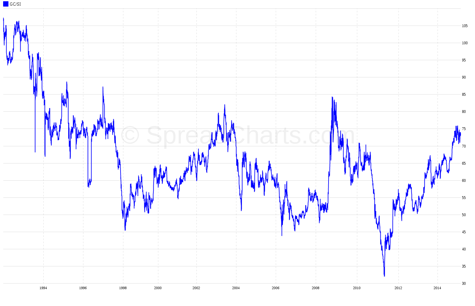
We’ve added a new feature! You can now create ratio charts between time series in our continuous futures database. Log into the app and pick “Historical ratios” in the right panel. There are two selectors delimited by a “/” division character. You can basically divide two time series and make some fundamentally important ratio charts, such as the gold to silver ratio:
Another example is the Dow to Gold ratio:
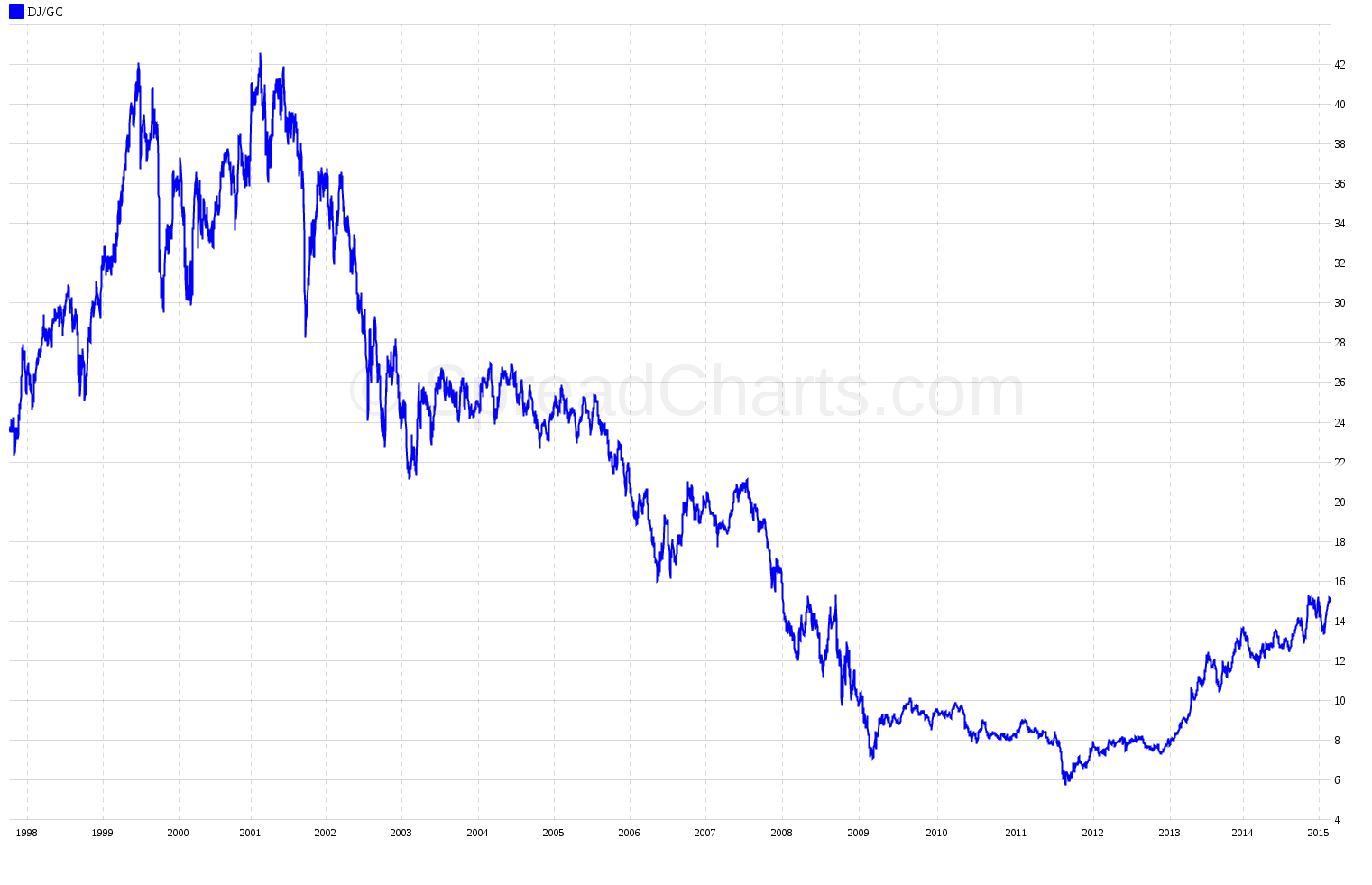
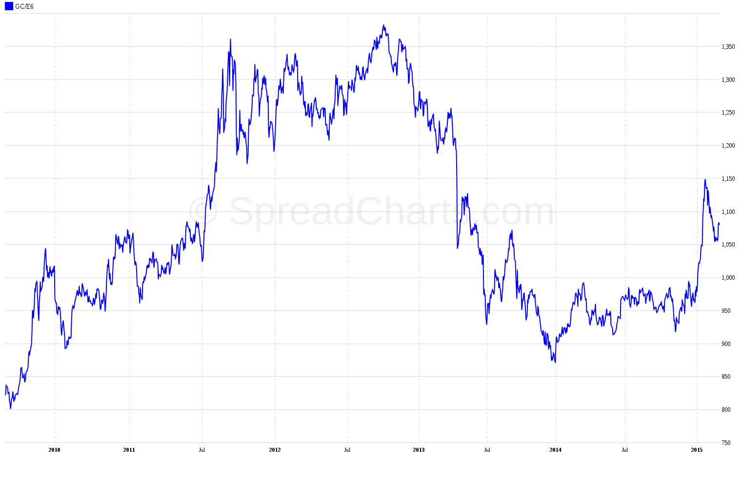
These are well-known ratios, watched by many market professionals on a weekly basis. However, you can also create some more exotic things, such as the price of commodities in various currencies. Here’s the gold price in euros:
Check out these great articles as well
New data: Sector indices
Our software is already established well beyond commodity market analysis. Stock indices, currencies, and even...
Read moreWhat’s new in the SpreadCharts app?
It’s been a few months since we launched the new version of the SpreadCharts app....
Read moreA major new version of the app is here
Today, we’re excited to show you the major new version of the SpreadCharts app that’s...
Read moreLiberation Day!
Tariffs are arguably the dumbest part of Trump’s agenda. Yes, the goal makes perfect sense,...
Read more