New widgets on your Dashboard
If you open the SpreadCharts app and go to the Dashboard, you’ll find new exciting widgets there. Previously, there was just the watchlist and the list of few latest articles published on our blog. Today, we’re launching two new widgets that will help you better navigate in our premium content.
Trading signals widget
The first one is the new widget for trading signals. It’s a matrix made of tiles of the most interesting signals on the current day. If you click on a tile, the app will highlight the corresponding signal in the Trading signals section.
Here’s how this widget looks like for premium users:
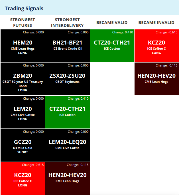
The signals are selected according to four different metrics:
- the first column shows the five strongest valid futures only signals
- the second column shows the five strongest valid interdelivery spread signals
- the third column shows the signals that have become valid today (their strength got above 1.0), no matter if they are spreads or directional futures
- and finally, the fourth column shows the signals that have become invalid today (their strength has fallen below 1.0)
Btw when a say today, it mostly means yesterday as we’re using End-of-Day data on SpreadCharts. The signals are updated overnight on our servers (it takes some time to run the calculation).
You have probably noticed the difference in the color of tiles. It corresponds to day-over-day changes in the strength of each signal – the greener the color, the higher the increase. Conversely, the intensity of red color reflects the amount of decrease in strength. The magnitude of the change is also displayed in numerical form in the top right corner of each tile.
Those of you who use the free version of SpreadCharts will see a slightly different matrix. It won’t show the full information about each contract or spread, just the underlying commodity and whether it’s an interdelivery or futures only signal.

I think the way to use the new trading signals widget is straightforward. Nevertheless, I have a few tips and recommendations for you. As I told you in the introductory article, don’t put too much attention to subtle differences in strength for signals in two different commodities. The model’s behavior is not absolutely consistent across various commodities. For example, it doesn’t make much sense to say that a signal for corn with a strength of 1.2 is better than a signal for soybeans with a strength of 1.0. That’s the reason why we didn’t include the precise strength of each signal in the tiles as it would cause unnecessary distraction. Additionally, even weaker signals that don’t even have to be valid can give you a hint of an interesting opportunity. So don’t forget to browse all the signals at least every few days under the Trading signals section of the app.
Personally, I like the last two columns the most. They list signals that became valid or invalid today, meaning they crossed the 1.0 threshold. Again, the 1.0 level is artificially set, and there is no clear boundary between good and bad signal. Nevertheless, I think it’s notable when a signal becomes valid or invalid, especially when the move across the threshold is significant. It’s not something that happens every day, which is why there may be days when you won’t see any tile in these last two columns. It is all the more important to pay attention to the signals you’ll see there.
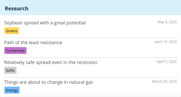
Research widget
The next addition to your Dashboard is the widget with the most recent videos from our premium Research. It’s basically a miniaturized version of the research section itself. If you click on any row, it will send you right into the Research section and open the selected video analysis.
The goal of these new widgets is to offer you a summary of all the important information right on Dashbord without the need to browse all the signals, research, or our blog separately. We think it will save you time and make experiencing the SpreadCharts app and all our content more pleasant.
P.S. Don’t forget to purge your browser cache or at least reload the app using Ctrl+Shift+R, so that you won’t be stuck with the old version of the app.
Check out these great articles as well
New data: Rates and electricity
As promised, we’re adding new data to the SpreadCharts app. Importantly, the goal is not...
Read moreNew data: Sector indices
Our software is already established well beyond commodity market analysis. Stock indices, currencies, and even...
Read moreWhat’s new in the SpreadCharts app?
It’s been a few months since we launched the new version of the SpreadCharts app....
Read moreA major new version of the app is here
Today, we’re excited to show you the major new version of the SpreadCharts app that’s...
Read more