Commodity spreads 16: Seasonal averages
Last time, we described how the seasonality works. Today, we’ll move from theory to practice. The easiest way how to visualize seasonality is through seasonal averages. Of course, you’ll find them in the SpreadCharts app. Here is an example for CBOT wheat:
How are the averages calculated
First of all, these are not just simple arithmetic averages. The calculation is more complicated, and I won’t delve into technical details as that would be annoying to most of you. But I’ll describe the methodology so that you’ll understand this tool.
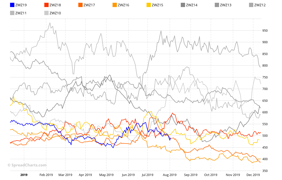
Let’s say we want to get seasonal averages for December Wheat futures (ZWZ19). The first step is to stack previous years (expirations) on top of each other as you can see on the following chart of stacked seasonality.
Then we select the right number of years (curves). For example, we are interested in seasonal trends over the previous 5 and 15 years. Now we can calculate the weighted average out of these curves. Each year is weighted according to its inverse standard deviation, so that abnormal years don’t distort the resulting average too much.
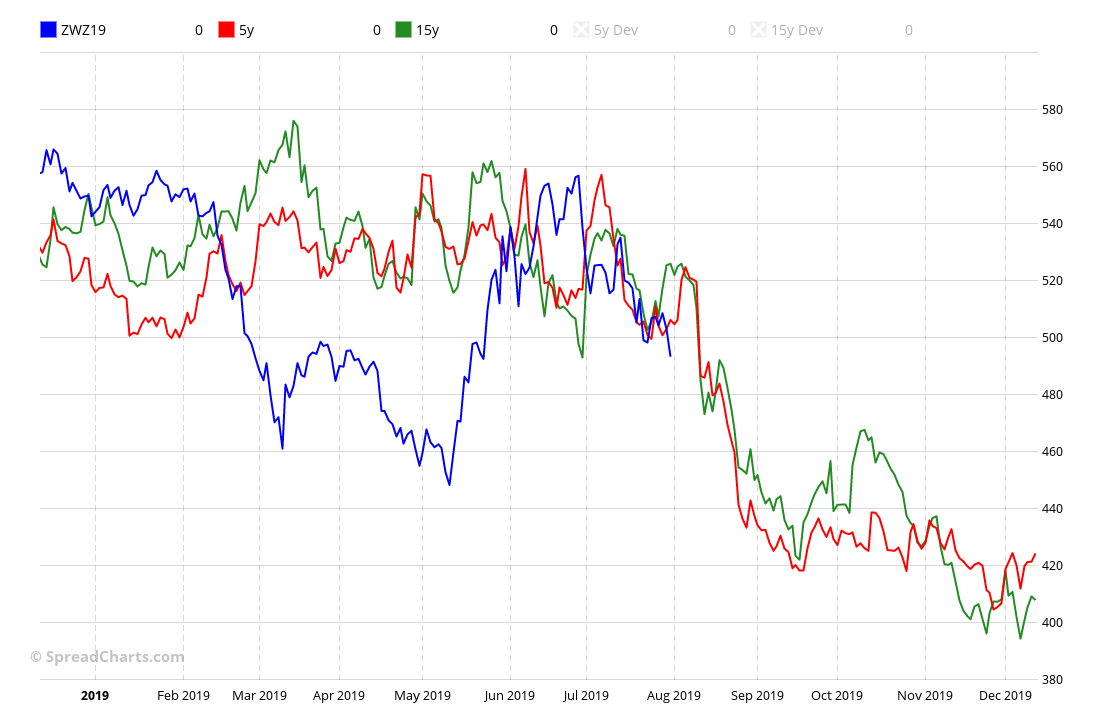
Then we need to display these averages together with the current year, in this case, it’s ZWZ19. However, plotting the averages and the current price in a single chart is difficult. These curves can have a very different scales, especially if the commodity has been in a long term trend. Therefore, we shift the averages (add or subtract a constant) so that they match the current price as much as possible. We also must not forget that not only the price of the commodity could vary over the years, but also it’s standard deviation. Therefore, we have to upscale/downscale even this quantity, which means stretching or squeezing the averages. And finally, here’s the result for the ZWZ19:
Pros & cons
Every tool or analysis has stronger and weaker points. Nothing is black and white and seasonal averages are no exception. Let’s highlight the advantages first.
- A clean and straightforward way how to express seasonal trends
- Easy to use, time effective
- Filters out outliers and abnormal years
And now the disadvantages:
- It hides the years when seasonality failed, therefore underestimates the risk
- Aggregation of data across many years wipes out the trend, i.e. changes of seasonality behavior over time
How to use the seasonal averages?
As we explained in the previous part of this series, seasonality is a very imprecise phenomenon. I saw people who spent hours doing very rigorous seasonal studies, thoroughly analyzing every tick in the seasonal curves and timing their trades in advance with unprecedented detail. All of them later found out it had been a waste of time. Seasonality doesn’t work that way. It’s like expecting the first snow on December 1st every year just because some statistics said so.
The good approach to seasonality is to take it with a grain of salt. Most commodities exhibit seasonal behavior, there is no doubt about that. But the timing can be very rough. Few weeks up or down doesn’t make any difference. Therefore, seasonal averages are sufficient tool for seasonal analysis. Although they smooth out a lot of information, it doesn’t really matter. Just look at their direction in the upcoming weeks or a few months, and that’s all. There is no need to complicate things.
The averages are especially useful during the screening process when you look for opportunities. They can quickly tell you if the seasonal outlook is favorable or not. However, during more detailed analysis before entering a trade, it’s wise to look also at the stacked seasonality chart. Not because of a desire to find a more precise entry, but because of risk assessment. Look for the abnormal years when the seasonality had failed. How would a repeat of such a scenario impact your trading account? That’s the only thing the averages won’t tell you.
Check out these great articles as well
New data: Sector indices
Our software is already established well beyond commodity market analysis. Stock indices, currencies, and even...
Read moreWhat’s new in the SpreadCharts app?
It’s been a few months since we launched the new version of the SpreadCharts app....
Read moreA major new version of the app is here
Today, we’re excited to show you the major new version of the SpreadCharts app that’s...
Read moreLiberation Day!
Tariffs are arguably the dumbest part of Trump’s agenda. Yes, the goal makes perfect sense,...
Read more