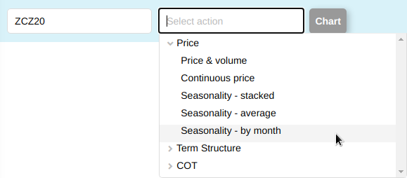
New chart: Seasonality by month
We used to have two types of seasonality charts in the SpreadCharts app. The seasonal averages can give you a quick overview of the seasonal trend and stacked seasonality is great for a more detailed analysis. Today, we’re adding the third type – seasonality by month.
A picture is worth a thousand words:
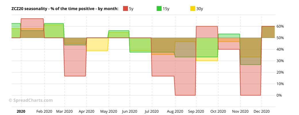
The chart shows how many times (in percentage terms) the contract/spread moved up in each month over the past 5, 15, and 30 year periods. Let’s focus on the red curve for example. Its value in August is exactly 0% which means the December corn contract has moved higher in August 0 times out of 5 last years, i.e. it the price has fallen in August every time over the last five years. That’s a pretty strong downward seasonal tendency. If we move along to September, the line jumps to 60% meaning the price increased in 3 out 5 past which might look like a slightly positive seasonal trend. However, the 30-year value for September (yellow) stands just at 30% which means the price moved higher only in 9 out of the past 30 years.
I think the logic is clear. The chart provides you additional information about the reliability of the seasonal trend broken down by month. Keep in mind it says nothing about the magnitude of the seasonal trend, just the frequency at which it occurs.
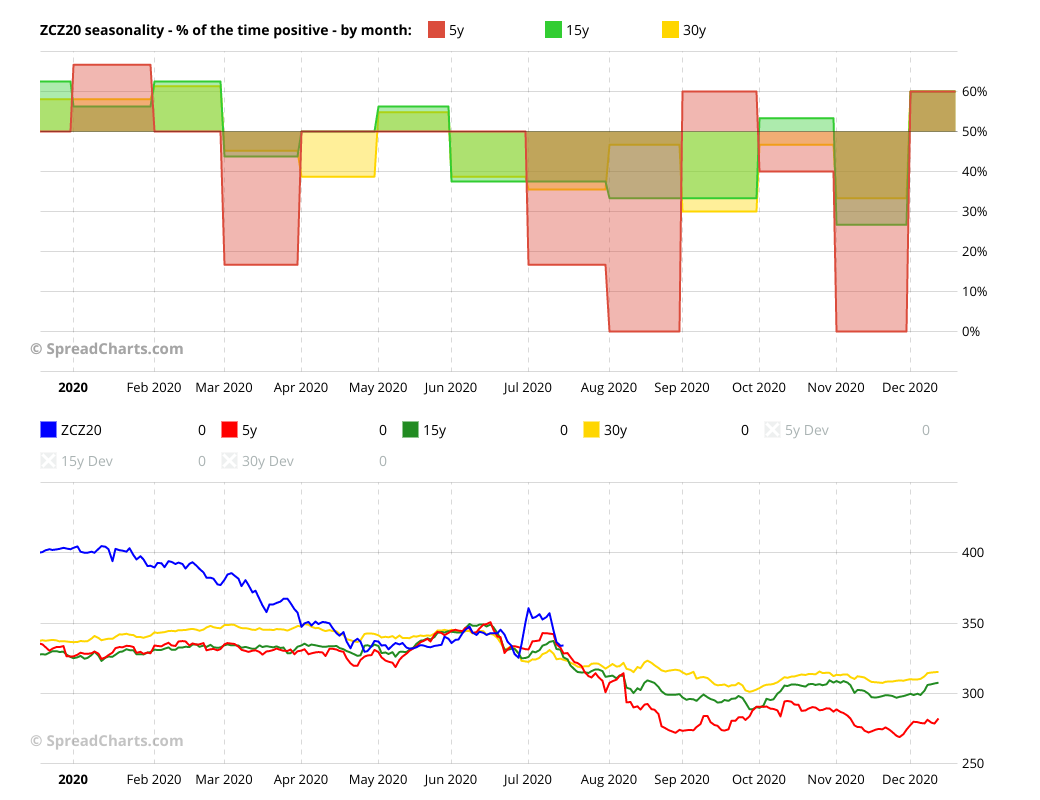
It can be a good complement to the averages or stacked seasonality chart. Speaking about the averages, we decided to add a 30-year average in addition to 5 and 15 years, so that it matches the new seasonality chart by month. I personally think the 30-year period is too long and many markets fundamentally change over that time, making the old seasonal trend irrelevant (imagine the natural gas market before fracking for example). However, that’s a matter of preference and we will leave it up to you to decide which period is the most relevant in every market.
Check out these great articles as well
New data: Rates and electricity
As promised, we’re adding new data to the SpreadCharts app. Importantly, the goal is not...
Read moreNew data: Sector indices
Our software is already established well beyond commodity market analysis. Stock indices, currencies, and even...
Read moreWhat’s new in the SpreadCharts app?
It’s been a few months since we launched the new version of the SpreadCharts app....
Read moreA major new version of the app is here
Today, we’re excited to show you the major new version of the SpreadCharts app that’s...
Read more