Commodity Spreads 11: What shows the contango histogram?
We have learned a lot in the past ten parts of our series about commodity spreads. We already understand what spreads are, how to trade them, and how to build your own strategy based on the current market situation. Great! Today I am going to explain a slightly more advanced thing that I use very often in my trading – contango histogram.
Small glossary at the beginning
When we talk about contango in general, we can think about both contango and backwardation. Contango generally refers to the market structure and it is calculated, similar to bear spreads, as the difference between the price of the more distant contract and the closer contract divided by the price of the closer contract. For example, for the first two expiration months, it is calculated as (F2-F1) / F1. Consequently, the contango is positive when the more distant contract (F2) is more expensive than the closer one (F1). Such a state of the market is commonly referred to as contango.
The opposite situation is a negative contango, for example, when the F2-F1 difference is negative. The first expiration month is therefore more expensive compared to the more distant one. This state of the market is referred to as backwardation.
Contango histogram
And now we can start with the contango histogram. Horizontal axis represents a contango rate. First, we need to find a zero bar that is represented by the lighter blue color. To the right of the zero, the market was in contango and on the left from zero in backwardation. The vertical axis of the chart then represents the frequency in days. It is very straightforward. The value of each column on the vertical axis tells us how many times the the selected combination of contracts has been at a certain state of contango over some period of time. This means that the higher the column is, the more often the market was in the given state. And vice versa.
The following chart shows the contango histogram for corn, namely the combination between the first two expiration months over the past 15 years.
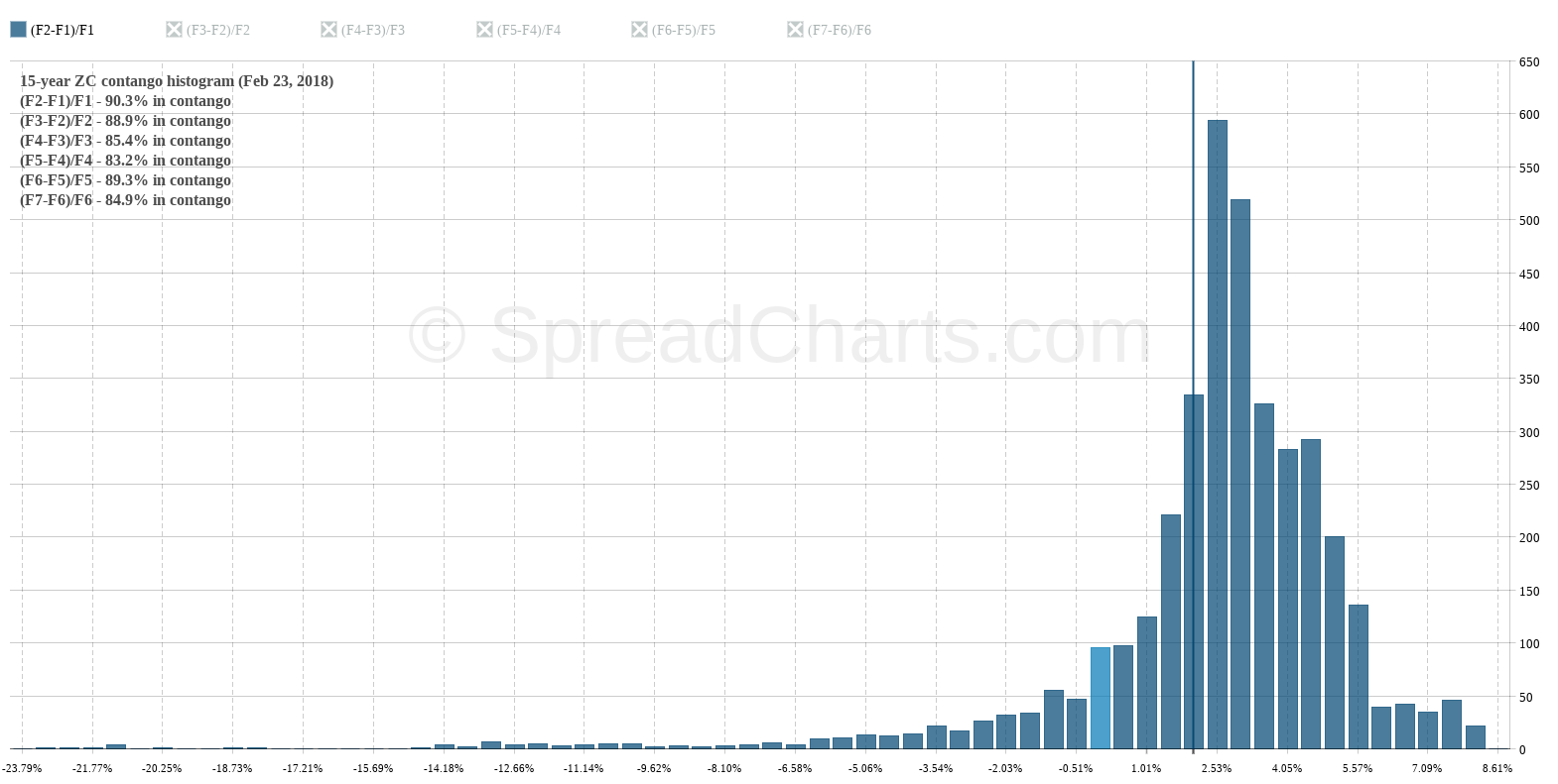
Thus, the Contango histogram shows the distribution of the contango for the last year, 5 years, 15 years, etc. It is an excellent tool because it is evident at first glance in which state the market has been the most often. And that’s very useful information for us as spread traders.
However, the vertical color line is very important here. It simply highlights the current contango rate. Thanks to it, we can compare the current state of the market with historical data. At first glance, we can see if the market is in the normal state and there is nothing exceptional, or whether the market is in an extreme situation.
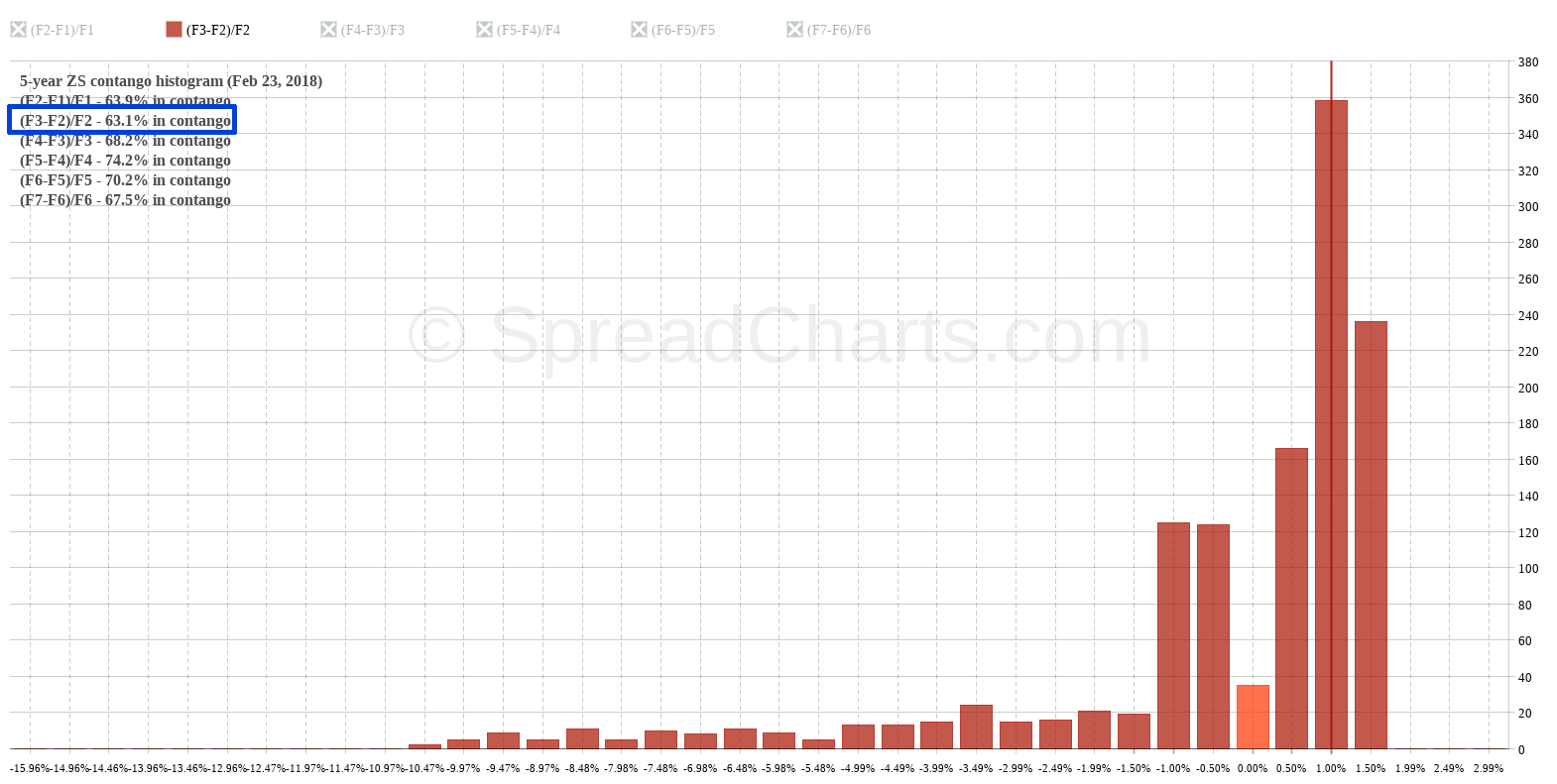
This is not all what SpreadCharts application offers when we speak about histogram. In the top left corner, you’ll also find the frequency of the positive contango for the selected combination of contracts and time period. For example, the following chart shows a soybean histogram. And we can see here that between the second and the third expiration month, the market was in contango in 63.1% of the time over the past five years. The rest of the time the market was logically in backwardation.
What’s next?
We have already explained how to correctly assemble a spread. However, one question remains, and it’s how to choose between various available expiration months in a particular situation? Sometimes we have fewer options, sometimes more, but we always have a choice. We’ll look into this next time.
Check out these great articles as well
New data: Rates and electricity
As promised, we’re adding new data to the SpreadCharts app. Importantly, the goal is not...
Read moreNew data: Sector indices
Our software is already established well beyond commodity market analysis. Stock indices, currencies, and even...
Read moreWhat’s new in the SpreadCharts app?
It’s been a few months since we launched the new version of the SpreadCharts app....
Read moreA major new version of the app is here
Today, we’re excited to show you the major new version of the SpreadCharts app that’s...
Read more